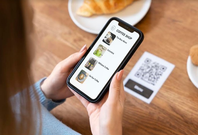
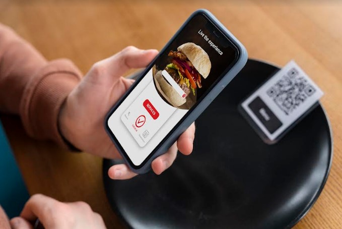
One of the first elements customers will have contact with at your food business is the QR menu. This format is here to stay and you have to make the most of it for your business.
But what does QR mean? A Quick Response code that stores information and can be read by our smartphones.
There is an important point about using QR to access the menu, and it is that sometimes is not friendly with the diner’s experience. Personally, I do not like the QR menu because many establishments use the same physical version in digital and the food cannot be appreciated, you cannot see the prices well and it is not even adapted to the cellphone screen. Yet, these are areas of opportunity for our businesses to differentiate from the competition.
Next, we will address 3 questions to take action and apply continuous improvement. As you read this article, open your digital menu and let’s review each question together:
- Is the font of my menu legible? Is my menu adapted to the smartphone?
I know that many times you can zoom in the menu with your fingers on the cellphone screen; but, as a recommendation, make life easy for the customer when accessing the menu, remember that the majority of diners may be seniors. I recommend that the font size is at least 18 points.

After checking this point: how is your font? Am I wrong or do you need to enlarge the font size of your menu?
Be careful! Because many times the reading is complicated by having such small letters; the diner is hungry and does not want to waste time reading.
- Are the photos that I upload appetizing?
Be honest, when you look at your food photos, does it make you hungry? If the answer is yes, great! You have a good menu. But if you answered no, then let’s fix it.

Imagine that your dishes are on the dating app Tinder and want to match with your customers. The profile picture to make customers crave can be of various styles, but the one that will favor your digital menu is the 45° front-facing photo because, just like people, dishes also have their best profile and their best angle.
- Does your menu look nice? Is it attractive? Does it have a concept?
One of the restaurants I visited in Guadalajara enchanted me with its beauty and details. The menu was designed by an artist, each dish was described in a very striking way and you could tell that each item told a story.
Check the eye-catching elements of your digital menu.
Here we only look at 3 key points, but in another article, I will share with you points focused on collecting database and testimonial reviews.
I encourage you to apply these tips and share with us how it went and all the ideas you got.
We co-created this content with Valentina Salazar – Food Marketing Consultant (@valentinasalazarmx) to help your business grow.
